Some time ago, a business expert needed help. His email sequence wasn’t working. The CTRs were low, unsubscribes were high and his Facebook ROAS (Return On Ad Spend) was dropping.
He asked me to take on an ambitious project to rewrite his email sequence.
So I did.
(The company sells a professional training course to established business owners and consultants.)
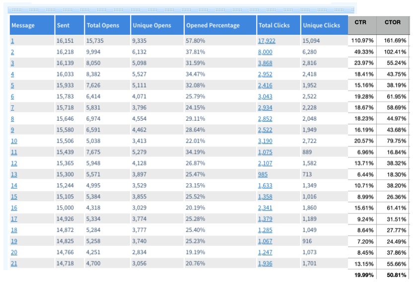
Now, after 379 days and 16,151 subscribers, it’s time to compare the results…

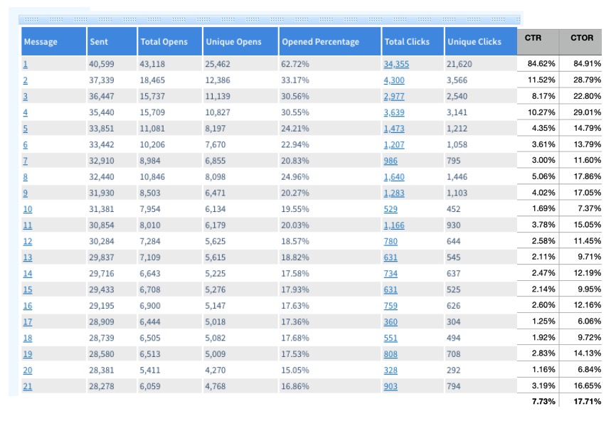
Averaged out, I increased the opens by 5.23%, the CTR by 12.26%, and the click-to-open rate (engagement) by 33.10%.
Here’s the breakdown of his old sequence inside Aweber…

Note: My client didn’t send over CTR or CTOR data, so I calculated it myself and added the columns to the right.
And here is the new sequence after my revamp…

Better yet, this new sequence now converts on cold Facebook traffic.
Today, they can consistently buy Facebook traffic and turn a profit.
So how did I boost this company’s average open rate by 5.23% and their CTR by 12.26%?
And, how did I do it without automation?
First of all, I could have simply shown you the stats 2 weeks after this new sequence launched, but I didn’t.
Those stats were much better and looked even more impressive.
However, showing the stats one year later provides more realistic and true data.
So here are the seven things I did in his new sequence.
1. No Bait And Switch
Most businesses and individuals entice visitors with a lead magnet.
Something like a report, video, cheat sheet, or worksheet.
However, people often unsubscribe at email #2 when exposed to this marketing tactic.
Why?
Because they didn’t want your emails, they wanted the thing you promised them.
Personally, I think this marketing practice is deceptive. (New European GDPR laws agree with me.)
If someone entices you with a juicy cool thing, do you want to join the newsletter?
Or, do you just want the gift?
Right, you want the gift.
Focusing on a lead magnet sets the wrong expectations.
And it starts the relationship off on the wrong foot.
Instead, this email sequence made it very clear:
“You’re signing up for a 21-part mini-course sent daily.”
2. Sequential Training Sequence
I started the subject line of each email with “Day 1:” “Day 2:” “Day 3:” etc.
Therefore, when people saw the lessons, they were more compelled to finish them all.
People hate to leave thoughts and ideas left incomplete in their minds.
Plus, I also made sure to…
3. Interconnect The Emails
When people opened email #2, they were directed to read email #1 if they missed it.
There were references to specific aspects of the previous lesson to re-pique curiosity and get them to consume the content.
In fact, to make it easier, I added a website link to each email too.
That means they could read the previous lesson’s content without digging through their inbox,
4. Compelling Stories
People love stories.
Facts are boring, stories are fun.
Strangely, this client wanted incredibly long emails (1,000+ words) and I couldn’t convince him otherwise.
Note: I recommend you keep emails under 300 words.
As a result, the content had to be very engaging.
Every email told one or multiple stories and many stories spanned across multiple days.
This used a technique called open loops.
You get subscribers curious about something. However, instead of finishing the thought you continue it later.
Furthermore, these stories were experiences from the thought leader’s own life (and those of his students.)
This demonstrated expertise and credibility to subscribers and helped sell their main program.
5. Quenched Curiosity With Links
What do I mean?
Oftentimes, to find out the conclusion to their stories, subscribers had to click a link and watch a video or case study.
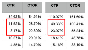
Just look at how big a difference this made for engagement during the first few emails…

Now, if you’re thinking, Chris, why is the new engagement for email #1 more than 100%?
That means people re-read the lesson on multiple devices.
Why?
Probably because the content was so long and they didn’t realize they’d be in for reading a novel.
6. Large Clickable Images
I added large inviting video thumbnails into these emails.
When you add a video image (especially with a play button on it) you boost clicks.
Plus, they could see the thumbnail, so when they clicked over to the page everything was congruent.
7. Benefit Driven CTAs
The call-to-action links started with action words.
Things like “Discover” “Check out” “Learn” and “Watch”.
The rest of the links used compelling bullets to get the click.
Copy like…
How To X Without Pain Y
4 Tips To X
The Easiest Way To X
This meant people knew exactly what the payoff would be for clicking on the link.
Imagine…
You read a fascinating story that spans over three emails and then finally the ending is revealed in a video.
Are you going to click the link?
Of course.
Conclusion
So there you have it.
Create an interconnected email mini-course that weaves stories, case studies, and key lessons into a narrative and hooks people to read until the end.
Make no mistake, this type of email sequence takes a lot of work.
However, if you have the time, dedication, and resources to do this for your offer, it’s well worth it.